
Hello and welcome! In this tutorial, we will be looking at how to create a music store website. Whether you’re a musician looking to sell your own music online or you’re an entrepreneur looking to start a business, this tutorial will give you the tools you need to get started. So let’s get started and learn how to create a musician website. Create a professional and functional music store website!”
Start by updating the various .html files we’re going to create such as Home, Products, About, Contact, Cart, and Checkout page. Start with the index.html which is our home page.
index.html
<!DOCTYPE html>
<html lang="en">
<head>
<meta charset="UTF-8">
<meta http-equiv="X-UA-Compatible" content="IE=edge">
<meta name="viewport" content="width=device-width, initial-scale=1.0">
<title>Big Store</title>
<!--styles-->
<link rel="stylesheet" href="https://cdnjs.cloudflare.com/ajax/libs/animate.css/4.1.0/animate.min.css">
<link rel="stylesheet" href="css/styles.css">
<link rel="stylesheet" href="https://stackpath.bootstrapcdn.com/bootstrap/4.5.2/css/bootstrap.min.css" integrity="sha384-JcKb8q3iqJ61gNV9KGb8thSsNjpSL0n8PARn9HuZOnIxN0hoP+VmmDGMN5t9UJ0Z" crossorigin="anonymous">
<!--font awesome-->
<link rel="stylesheet" href="https://cdnjs.cloudflare.com/ajax/libs/font-awesome/5.15.3/css/all.min.css">
<!--Google Fonts-->
<link href="https://fonts.googleapis.com/css2?family=Lobster&display=swap" rel="stylesheet">
</head>
<body>
<nav class="navbar navbar-fixed-top navbar-expand-lg navbar-light">
<a class="navbar-brand" href="#"></a>
<button class="navbar-toggler" type="button" data-toggle="collapse" data-target="#navbarNav" aria-controls="navbarNav" aria-expanded="false" aria-label="Toggle navigation">
<span class="navbar-toggler-icon"></span>
</button>
<div class="collapse navbar-collapse" id="navbarNav">
<ul class="navbar-nav ml-auto">
<li class="nav-item active">
<a class="nav-link" href="/index.html">Home</a>
</li>
<li class="nav-item">
<a class="nav-link" href="/product.html">Products</a>
</li>
<li class="nav-item">
<a class="nav-link" href="/about.html">About</a>
</li>
<li class="nav-item">
<a class="nav-link" href="/contact.html">Contact</a>
</li>
</ul>
</div>
</nav>
<!--digital products-->
<section>
<div class="container-fluid content-row mt-5">
<div class="title-container">
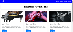
<h1>Welcome to our Music Store</h1>
</div>
<div class="row">
<div class="col-sm-12 col-lg-4">
<div class="card mb-2 mb-md-0">
<img src="images/piano.png" class="card-img-top" alt="Piano">
<div class="card-body">
<h5 class="card-title">Learn Piano</h5>
<p class="card-text">Some quick example text to build on the card title and make up the bulk of the card's content.</p>
<h6 class="card-subtitle mb-2 text-muted">$99.99</h6>
<a href="/checkout.html" class="btn btn-primary">Buy Now</a>
</div>
</div>
</div>
<div class="col-sm-12 col-lg-4">
<div class="card mb-2 mb-md-0">
<img src="images/lead.jpg" class="card-img-top" alt="lead">
<div class="card-body">
<h5 class="card-title">Learn Lead Guitar</h5>
<p class="card-text">Some quick example text to build on the card title and make up the bulk of the card's content.</p>
<h6 class="card-subtitle mb-2 text-muted">$99.99</h6>
<a href="/checkout.html" class="btn btn-primary">Buy Now</a>
</div>
</div>
</div>
<div class="col-sm-12 col-lg-4">
<div class="card mb-2 mb-md-0">
<img src="images/bass.jpg" class="card-img-top" alt="bass">
<div class="card-body">
<h5 class="card-title">Learn Bass Guitar</h5>
<p class="card-text">Some quick example text to build on the card title and make up the bulk of the card's content.</p>
<h6 class="card-subtitle mb-2 text-muted">$99.99</h6>
<a href="/checkout.html" class="btn btn-primary">Buy Now</a>
</div>
</div>
</div>
</div>
</div>
</section>
<section>
<footer>
<div class="container">
<div class="row">
<div class="col-sm-4">
<h4>Follow us</h4>
<a href="#"><i class="fab fa-facebook-square"></i></a>
<a href="#"><i class="fab fa-twitter-square"></i></a>
<a href="#"><i class="fab fa-instagram"></i></a>
</div>
<div class="col-sm-4">
<h4>Quick links</h4>
<ul class="quick-links">
<li><a href="#">Home</a></li>
<li><a href="#">About</a></li>
<li><a href="#">Products</a></li>
<li><a href="#">Contact</a></li>
</ul>
</div>
<div class="col-sm-4 text-right">
<p>Copyright © 2022 Big Store</p>
</div>
</div>
</div>
</footer>
</section>
<script src="scripts/main.js"></script>
<script src="https://code.jquery.com/jquery-3.5.1.slim.min.js" integrity="sha384-DfXdz2htPH0lsSSs5nCTpuj/zy4C+OGpamoFVy38MVBnE+IbbVYUew+OrCXaRkfj" crossorigin="anonymous"></script>
<script src="https://cdn.jsdelivr.net/npm/@popperjs/core@2.16.3/dist/umd/popper.min.js" integrity="sha384-c7VdZrOuZQVYTJT0T7C8+sJEFy7OjK9XuJZL8jSDAmhZU6wSKU6pjW872v67l4Q" crossorigin="anonymous"></script>
<script src="https://stackpath.bootstrapcdn.com/bootstrap/4.5.2/js/bootstrap.min.js" integrity="sha384-B4gt1jrGC7Jh4AgTPSdUtOBvfO8shuf57BaghqFfPlYxofvL8/KUEfYiJOMMV+rV" crossorigin="anonymous"></script>
</body>
</html>Here is a brief summary of what the main parts of the code do:
- The
<!DOCTYPE html>declaration tells the web browser that this is an HTML document. - The
<html>element is the root element of the HTML document and contains all of the content on the webpage. - The
<head>element contains metadata about the webpage, such as the title, stylesheets, and scripts. - The
<body>element contains the content of the webpage, such as the navigation bar and the main content. - The
<nav>element represents a section of the webpage that contains navigation links. - The
<a>elements are used to create links to other pages or locations on the same page. - The
<img>element is used to include images in the webpage. - The
<form>element represents a form that the user can fill out and submit. - The
<input>element represents a form control where the user can enter input. - The
<button>element represents a button that the user can click. - The
<ul>element represents an unordered list. - The
<li>element represents a list item.
This code creates a basic HTML webpage with a navigation bar, some images, and a form. The navigation bar contains links to other pages, and the form allows the user to enter input and submit it. The code also includes some stylesheets and scripts, which are used to apply styles and add functionality to the webpage.
Product.html
<nav class="navbar navbar-expand-lg navbar-light">
<a class="navbar-brand" href="#"></a>
<button class="navbar-toggler" type="button" data-toggle="collapse" data-target="#navbarNav" aria-controls="navbarNav" aria-expanded="false" aria-label="Toggle navigation">
<span class="navbar-toggler-icon"></span>
</button>
<div class="collapse navbar-collapse" id="navbarNav">
<ul class="navbar-nav ml-auto">
<li class="nav-item active">
<a class="nav-link" href="/index.html">Home</a>
</li>
<li class="nav-item">
<a class="nav-link" href="/product.html">Products</a>
</li>
<li class="nav-item">
<a class="nav-link" href="/about.html">About</a>
</li>
<li class="nav-item">
<a class="nav-link" href="/contact.html">Contact</a>
</li>
</ul>
</div>
</nav>
<div class="container mt-5">
<div class="title-container">
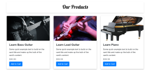
<h1>Our Products</h1>
</div>
<div class="row">
<!-- Add product cards -->
<div class="col-sm-12 col-md-6 col-lg-4 mb-4">
<div class="card">
<img src="images/bass.jpg" class="card-img-top" alt="Learn Bass Guitar">
<div class="card-body">
<h5 class="card-title">Learn Bass Guitar</h5>
<p class="card-text">Some quick example text to build on the card title and make up the bulk of the card's content.</p>
<h6 class="card-subtitle mb-2 text-muted">$99.99</h6>
<a href="/cart.html" class="btn btn-primary">Add to Cart</a>
</div>
</div>
</div>
<div class="col-sm-12 col-md-6 col-lg-4 mb-4">
<div class="card">
<img src="images/lead.jpg" class="card-img-top" alt="Product 2">
<div class="card-body">
<h5 class="card-title">Learn Lead Guitar</h5>
<p class="card-text">Some quick example text to build on the card title and make up the bulk of the card's content.</p>
<h6 class="card-subtitle mb-2 text-muted">$99.99</h6>
<a href="#" class="btn btn-primary">Add to Cart</a>
</div>
</div>
</div>
<div class="col-sm-12 col-md-6 col-lg-4 mb-4">
<div class="card">
<img src="images/piano.png" class="card-img-top" alt="Learn Piano">
<div class="card-body">
<h5 class="card-title">Learn Piano</h5>
<p class="card-text">Some quick example text to build on the card title and make up the bulk of the card's content.</p>
<h6 class="card-subtitle mb-2 text-muted">$99.99</h6>
<a href="#" class="btn btn-primary">Add to Cart</a>
</div>
</div>
</div>
<div class="col-sm-12 col-md-6 col-lg-4 mb-4">
<div class="card">
<img src="images/bass.jpg" class="card-img-top" alt="Learn Bass Guitar">
<div class="card-body">
<h5 class="card-title">Learn Bass Guitar</h5>
<p class="card-text">Some quick example text to build on the card title and make up the bulk of the card's content.</p>
<h6 class="card-subtitle mb-2 text-muted">$99.99</h6>
<a href="#" class="btn btn-primary">Add to Cart</a>
</div>
</div>
</div>
<div class="col-sm-12 col-md-6 col-lg-4 mb-4">
<div class="card">
<img src="images/piano.png" class="card-img-top" alt="Product 2">
<div class="card-body">
<h5 class="card-title">Learn Piano</h5>
<p class="card-text">Some quick example text to build on the card title and make up the bulk of the card's content.</p>
<h6 class="card-subtitle mb-2 text-muted">$99.99</h6>
<a href="#" class="btn btn-primary">Add to Cart</a>
</div>
</div>
</div>
<div class="col-sm-12 col-md-6 col-lg-4 mb-4">
<div class="card">
<img src="images/bass.jpg" class="card-img-top" alt="Learn Bass Guitar">
<div class="card-body">
<h5 class="card-title">Learn Bass Guitar</h5>
<p class="card-text">Some quick example text to build on the card title and make up the bulk of the card's content.</p>
<h6 class="card-subtitle mb-2 text-muted">$99.99</h6>
<a href="#" class="btn btn-primary">Add to Cart</a>
</div>
</div>
</div>
</div>
</div>This code creates a navigation bar at the top of the webpage and a section of the webpage with three product cards.
The navigation bar contains links to other pages on the website, such as the home page, products page, about page, and contact page. The navigation bar also includes a toggle button that allows the user to expand or collapse the navigation links.
The product cards display images and information about different products, such as the name, a brief description, and the price. Each card also includes a “Add to Cart” button that allows the user to add the product to their shopping cart.
The product cards are created using a combination of HTML elements, such as the <nav>, <a>, <img>, <h5>, <p>, <h6>, and <button> elements. These elements are styled using CSS classes, such as the navbar, card, and btn classes.
About.html
<nav class="navbar navbar-expand-lg navbar-light">
<a class="navbar-brand" href="#"></a>
<button class="navbar-toggler" type="button" data-toggle="collapse" data-target="#navbarNav" aria-controls="navbarNav" aria-expanded="false" aria-label="Toggle navigation">
<span class="navbar-toggler-icon"></span>
</button>
<div class="collapse navbar-collapse" id="navbarNav">
<ul class="navbar-nav ml-auto">
<li class="nav-item active">
<a class="nav-link" href="/index.html">Home</a>
</li>
<li class="nav-item">
<a class="nav-link" href="/product.html">Products</a>
</li>
<li class="nav-item">
<a class="nav-link" href="/about.html">About</a>
</li>
<li class="nav-item">
<a class="nav-link" href="/contact.html">Contact</a>
</li>
</ul>
</div>
</nav>
<!-- Add main content -->
<div class="container mt-5">
<div class="title-container">
<h1 class="text-center mb-4">About Our Music Store</h1>
</div>
<div class="row">
<div class="col-md-6">
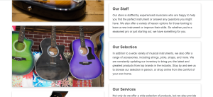
<img src="images/bass-guitar.jpg" alt="Store front" class="img-fluid rounded mb-4">
<img src="images/guitar.jpg" alt="Store front" class="img-fluid rounded mb-4">
<img src="images/piano.png" alt="Store front" class="img-fluid rounded mb-4">
</div>
<div class="col-md-6">
<div class="card mb-4">
<div class="card-body">
<h2 class="card-title">Our Story</h2>
<p class="card-text">Welcome to our music store! We are a locally-owned business that has been serving the community for over 20 years. Our store offers a wide selection of musical instruments and accessories, as well as lessons and repairs. We pride ourselves on providing top-notch customer service and a welcoming atmosphere for musicians of all levels.</p>
</div>
</div>
<div class="card mb-4">
<div class="card-body">
<h2 class="card-title">Our Staff</h2>
<p class="card-text">Our store is staffed by experienced musicians who are happy to help you find the perfect instrument or answer any questions you might have. We also offer a variety of lesson options for those looking to learn a new instrument or improve their skills. So whether you're a seasoned pro or just starting out, we have something for you.</p>
</div>
</div>
<div class="card mb-4">
<div class="card-body">
<h2 class="card-title">Our Selection</h2>
<p class="card-text">In addition to a wide variety of musical instruments, we also offer a range of accessories, including strings, picks, straps, and more. We are constantly updating our inventory to bring you the latest and greatest products from top brands in the industry. Stop by and see us to browse our selection in person, or shop online from the comfort of your own home.</p>
</div>
</div>
<div class="card mb-4">
<div class="card-body">
<h2 class="card-title">Our Services</h2>
<p class="card-text">Not only do we offer a wide selection of products, but we also provide expert repairs and maintenance for your instruments. Our team of skilled technicians can handle everything from simple setups to major repairs, ensuring that your instrument is always in top condition. We also offer instrument rentals for those looking to try out a new instrument before committing to a purchase.</p>
</div>
</div>
</div>
</div>
</div>This code creates a webpage that displays information about a music store. The webpage includes a navigation bar at the top, with links to other pages on the website, and a main content area that includes text and images about the store.
The main content is divided into several sections, each containing a title and some text. The sections are created using <div> elements with the card class applied, which creates a visually appealing card-like layout. The text in each section is contained within a <div> element with the card-body class, and the title is contained within an <h2> element with the card-title class.
The main content area also includes several images, which are added using the <img> element. The images are styled using the img-fluid and rounded classes, which make them responsive and add rounded corners to the edges.
Contact.html
<nav class="navbar navbar-expand-lg navbar-light">
        <a class="navbar-brand" href="#"></a>
        <button class="navbar-toggler" type="button" data-toggle="collapse" data-target="#navbarNav" aria-controls="navbarNav" aria-expanded="false" aria-label="Toggle navigation">
          <span class="navbar-toggler-icon"></span>
        </button>
        <div class="collapse navbar-collapse" id="navbarNav">
          <ul class="navbar-nav ml-auto">
            <li class="nav-item active">
              <a class="nav-link" href="index.html">Home</a>
            </li>
            <li class="nav-item">
              <a class="nav-link" href="/product.html">Products</a>
            </li>
            <li class="nav-item">
              <a class="nav-link" href="/about.html">About</a>
            </li>
            <li class="nav-item">
              <a class="nav-link" href="/contact.html">Contact</a>
            </li>
          </ul>
        </div>
      </nav>

      <div class="container mt-5">
        <h1>Contact Us</h1>
       <form>
          <div class="row">
            <div class="col-sm-6">
              <div class="form-group">
                <label for="name">Name</label>
                <input type="text" class="form-control" id="name" placeholder="Enter your name">
              </div>
            </div>
            <div class="col-sm-6">
              <div class="form-group">
                <label for="email">Email</label>
                <input type="email" class="form-control" id="email" placeholder="Enter your email">
              </div>
            </div>
          </div>
          <div class="form-group">
            <label for="message">Message</label>
            <textarea class="form-control" id="message" rows="3"></textarea>
          </div>
          <button type="submit" class="btn btn-primary">Submit</button>
        </form>
    </div>
This code creates a navigation bar at the top of the webpage using the nav element. The navigation bar contains links to different pages on the website, such as the home page, products page, about page, and contact page. The navigation bar also has a toggle button that allows the links to be shown or hidden on smaller screens.Below the navigation bar, there is a contact form that allows users to enter their name, email, and a message. There is also a submit button that allows the user to send the form when they are finished filling it out. The form is contained within a div element with the class “container” and a heading element that says “Contact Us”.
Cart.html
<nav class="navbar navbar-expand-lg navbar-light">
<a class="navbar-brand" href="#"></a>
<button class="navbar-toggler" type="button" data-toggle="collapse" data-target="#navbarNav" aria-controls="navbarNav" aria-expanded="false" aria-label="Toggle navigation">
<span class="navbar-toggler-icon"></span>
</button>
<div class="collapse navbar-collapse" id="navbarNav">
<ul class="navbar-nav ml-auto">
<li class="nav-item active">
<a class="nav-link" href="/index.html">Home</a>
</li>
<li class="nav-item">
<a class="nav-link" href="/product.html">Products</a>
</li>
<li class="nav-item">
<a class="nav-link" href="/about.html">About</a>
</li>
<li class="nav-item">
<a class="nav-link" href="/contact.html">Contact</a>
</li>
</ul>
</div>
</nav>
<!-- Add main content -->
<div class="container mt-5">
<div class="title-container">
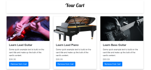
<h1 class="text-center mb-4">Your Cart</h1>
</div>
<div class="row">
<!-- Add product card -->
<div class="col-md-4 mb-4">
<div class="card">
<img src="/images/lead.jpg" alt="Product" class="card-img-top">
<div class="card-body">
<h5 class="card-title">Learn Lead Guitar</h5>
<p class="card-text">Some quick example text to build on the card title and make up the bulk of the card's content.</p>
<h6 class="card-subtitle mb-2 text-muted">$99.99</h6>
<a href="#" class="btn btn-primary">Remove from Cart</a>
</div>
</div>
</div>
<!-- Add more product cards as needed -->
<div class="col-md-4 mb-4">
<div class="card">
<img src="/images/piano.png" alt="Product" class="card-img-top">
<div class="card-body">
<h5 class="card-title">Learn Lead Piano</h5>
<p class="card-text">Some quick example text to build on the card title and make up the bulk of the card's content.</p>
<h6 class="card-subtitle mb-2 text-muted">$99.99</h6>
<a href="#" class="btn btn-primary">Remove from Cart</a>
</div>
</div>
</div>
<div class="col-md-4 mb-4">
<div class="card">
<img src="/images/bass.jpg" alt="Product" class="card-img-top">
<div class="card-body">
<h5 class="card-title">Learn Bass Guitar</h5>
<p class="card-text">Some quick example text to build on the card title and make up the bulk of the card's content.</p>
<h6 class="card-subtitle mb-2 text-muted">$99.99</h6>
<a href="#" class="btn btn-primary">Remove from Cart</a>
</div>
</div>
</div>
</div>
<!-- Add total and checkout buttons -->
<div class="row mt-4">
<div class="col-md-6 offset-md-6 text-right">
<h4>Total: $99.99</h4>
<a href="/checkout.html" class="btn btn-primary">Checkout</a>
</div>
</div>
</div>
This code is for a webpage that displays a shopping cart. The nav element at the top of the page is a navigation bar that allows the user to navigate to different pages on the website, such as the home page, the product page, the about page, and the contact page.
The main content of the page is a container element with the class “container mt-5”, which contains a title and a row of product cards. Each product card consists of an image, a card body with a title, a description, a price, and a button to remove the product from the cart. The row also includes a total and a checkout button at the bottom.
The form element allows users to input their name, email, and a message, and submit them using the submit button.
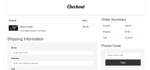
Checkout.html
<nav class="navbar navbar-expand-lg navbar-light">
  <a class="navbar-brand" href="#"></a>
  <button class="navbar-toggler" type="button" data-toggle="collapse" data-target="#navbarNav" aria-controls="navbarNav" aria-expanded="false" aria-label="Toggle navigation">
    <span class="navbar-toggler-icon"></span>
  </button>
  <div class="collapse navbar-collapse" id="navbarNav">
    <ul class="navbar-nav ml-auto">
      <li class="nav-item active">
        <a class="nav-link" href="/index.html">Home</a>
      </li>
      <li class="nav-item">
        <a class="nav-link" href="/product.html">Products</a>
      </li>
      <li class="nav-item">
        <a class="nav-link" href="/about.html">About</a>
      </li>
      <li class="nav-item">
        <a class="nav-link" href="/contact.html">Contact</a>
      </li>
    </ul>
  </div>
</nav>


<div class="container mt-5">
    <div class="title-container">
        <h1 class="text-center mb-4">Checkout</h1>
        </div>
    <div class="row">
      <div class="col-md-8">
        <!-- Add product details -->
        <table class="table mb-4">
          <thead>
            <tr>
              <th>Product</th>
              <th>Price</th>
            </tr>
          </thead>
          <tbody>
            <tr>
              <td>
                <div class="media">
                  <img src="images/bass.jpg" alt="Product" class="mr-3" style="width: 75px;">
                  <div class="media-body">
                    <h5 class="mt-0">Bass Guitar</h5>
                   Learn Bass Guitar in 20 days
                  </div>
                </div>
              </td>
              <td>$99.99</td>
            </tr>
            <!-- Add more product rows as needed -->
          </tbody>
        </table>
        <!-- Add shipping and payment options -->
        <h2>Shipping Information</h2>
        <form>
          <div class="form-group">
            <label for="name">Name</label>
            <input type="text" class="form-control" id="name" placeholder="Enter your name">
          </div>
          <div class="form-group">
            <label for="address">Address</label>
            <input type="text" class="form-control" id="address" placeholder="Enter your shipping address">
          </div>
          <div class="form-group">
            <label for="city">City</label>
            <input type="text" class="form-control" id="city" placeholder="Enter your city">
          </div>
          <div class="form-group">
            <label for="state">State</label>
            <input type="text" class="form-control" id="state" placeholder="Enter your state">
          </div>
          <div class="form-group">
            <label for="zip">Zip Code</label>
            <input type="text" class="form-control" id="zip" placeholder="Enter your zip code">
          </div>
          <h2>Payment Method</h2>
          <div class="form-check">
            <input class="form-check-input" type="radio" name="payment" id="credit" value="credit" checked>
            <label class="form-check-label" for="credit">
              Credit Card
            </label>
          </div>
          <div class="form-check">
            <input class="form-check-input" type="radio" name="payment" id="paypal" value="paypal">
  <label class="form-check-label" for="paypal">
              Paypal
            </label>
          </div>
          <div class="form-group mt-4">
            <button type="submit" class="btn btn-primary btn-lg btn-block">Place Order</button>
          </div>
        </form>
      </div>
      <div class="col-md-4">
        <!-- Add order summary -->
        <h3>Order Summary</h3>
        <table class="table mb-4">
          <tbody>
            <tr>
              <td>Subtotal</td>
              <td>$99.99</td>
            </tr>
            <tr>
              <td>Shipping</td>
              <td>$9.99</td>
            </tr>
            <tr>
              <td>Total</td>
              <td>$109.98</td>
            </tr>
          </tbody>
        </table>
        <!-- Add promo code form -->
        <h3>Promo Code</h3>
        <form>
          <div class="form-group">
            <input type="text" class="form-control" id="promo-code" placeholder="Enter promo code">
          </div>
          <button type="submit" class="btn btn-secondary">Apply</button>
        </form>
      </div>
    </div>
  </div>
This is a basic HTML template for a website with a navigation bar and several pages. The navigation bar is created using the nav element and the navbar class from the Bootstrap framework. The navigation bar includes links to four pages: “Home,” “Products,” “About,” and “Contact.”
The template includes a div element with the class “container” that wraps the main content of the page. Within the container, there is a div element with the class “title-container” that includes an h1 element with a title for the page. The template also includes several div elements with the class “card” that are used to display content in a visually appealing way. Each card includes a div element with the class “card-body” that contains the content for the card.
The template also includes a form for collecting contact information and a form for collecting shipping and payment information during checkout. Each form includes various input elements and label elements to allow the user to enter their information. The template also includes buttons for submitting the form and removing items from a shopping cart.
We aslo have css/styles.css which has the following styling…
css/styles.css
.navbar {
    background-color: blue;
  }


.navbar-light .navbar-brand {
    color: rgb(255, 255, 255)!important;
}


.navbar-brand {
  position: relative;
  background: url(../images/BS.png);
  width: 100px;
  left: -25px;
  background-size: cover;
  background-repeat: no-repeat;
  background-position: center;
  height: 42px;
}


  .nav-link {
    color: white!important;
  }

  .navbar a:hover {
    color: rgba(233, 223, 216, 0.981);
    transition: color 0.3s ease;
  }


  .navbar-toggler {
    border: 1px solid #f8f9fa;
  }


  .navbar-light .navbar-toggler {
    color: rgba(0,0,0,.5);
    border-color: rgba(0,0,0,.5)!important;
}


h1 {
  text-align: center;
  color: #000;
  font-size: 3rem;
  font-weight: bold;
  margin-bottom: 2rem;
}


.title-container {
  position: relative;
  bottom: 25px;
  padding: 1rem 0;
  box-shadow: 0 5px 10px rgba(0, 0, 0, 0.1);
}


h1 {
  font-family: 'Lobster', cursive;
}


.card {
  margin-bottom: 1rem;
}


.card-img-top {
  width: 100%;
  height: 40vh;
  object-fit: cover;
}


@media (max-width: 576px) {
  .title-container h1 {
    font-size: 1.5rem;
  }
}


/* footer */


footer {
  background-color: #333;
  color: #fff;
  padding: 1rem 0;
  text-align: center;
  margin-top: 20px;

}


footer a {
  color: #fff;
  font-size: 1.5rem;
  margin-right: 0.5rem;
}


footer a:hover {
  color: #eee;
}


  /* Fade in/out */
  i {
    transition: all 0.2s ease;
  }


  /* Fade in/out */
  i {
    transition: all 0.2s ease;
  }


  /* Slide in/out */
  i {
    transition: all 0.2s ease;
    transform: translateX(-50%);
  }


  i:hover {
    transform: translateX(0);
  }


  /* Rotate */
  i {
    transition: all 0.2s ease;
    transform: rotate(0deg);
  }


  i:hover {
    transform: rotate(45deg);
  }


  .quick-links {
    list-style: none;
  }

  /* Animations */


  .title-container {
    /* Initial state: hidden */
    opacity: 0;

    /* Animate to visible state */
    animation: fadeInUp 0.5s ease-out;
    animation-fill-mode: both;
  }


  .card {
    /* Initial state: hidden */
    opacity: 0;

    /* Animate to visible state */
    animation: fadeInUp 0.8s ease-out;
    animation-fill-mode: both;
  }


@media (max-width: 576px) {
  footer p {
    text-align: center;
  }
}


/* Contact Page */


form {
  /* Add some padding to the form */
  padding: 2rem;


  /* Add a background color to the form */
  background-color: #f5f5f5;


  /* Add some border radius to the form */
  border-radius: 1rem;
}


form label {
  /* Add some color to the labels */
  color: #333;


  /* Make the labels bold */
  font-weight: bold;
}


form input[type="text"],
form input[type="email"],
form textarea {
  /* Add some padding to the input fields */
  padding: 0.75rem 1rem;


  /* Add a border and some border radius to the input fields */
  border: 1px solid #ddd;
  border-radius: 0.25rem;


  /* Add some margin to the bottom of the input fields */
  margin-bottom: 1rem;


  /* Make the input fields wider */
  width: 100%;
}


form textarea {
  /* Make the textarea element taller */
  height: 10rem;


  /* Add some vertical padding to the textarea element */
  padding: 1rem;
}


form button[type="submit"] {
  /* Add some padding to the submit button */
  padding: 0.75rem 1.5rem;


  /* Add some color to the submit button */
  color: #fff;
  background-color: #333;


  /* Add some border radius to the submit button */
  border-radius: 0.25rem;


  /* Make the submit button wider */
  width: 100%;
}


/* About Page */


.container {
  font-family: Arial, sans-serif;
}


h2 {
  font-size: 1.75rem;
  color: #333;
  margin-bottom: 1rem;
}


.img-fluid {
  box-shadow: 0 4px 8px 0 rgba(0,0,0,0.2);
  transition: 0.3s;
}


img:hover {
  box-shadow: 0 8px 16px 0 rgba(0,0,0,0.2);
}


/* Cart Page */


.card {
  box-shadow: 0 4px 8px 0 rgba(0,0,0,0.2);
  transition: 0.3s;
}


.card:hover {
  box-shadow: 0 8px 16px 0 rgba(0,0,0,0.2);
}


.card-img-top {
  width: 100%;
  height: 200px;
  object-fit: cover;
}


.card-body {
  padding: 20px;
}


.card-title {
  font-size: 22px;
  font-weight: bold;
}


.card-subtitle {
  font-size: 18px;
  color: #6c757d;
}


.btn-primary {
  background-color: #007bff;
  border-color: #007bff;
  font-size: 14px;
  font-weight: bold;
  padding: 10px 20px;
}


.btn-primary:hover {
  background-color: #0069d9;
  border-color: #0062cc;
}
The CSS that is used to apply styles to the HTML elements on the webpages. The styles specified in this code will affect the layout, colors, and typography of the webpage.
The code includes styles for a navbar element, which is a navigation menu that appears at the top of the webpage. It includes styles for the font and background color of the navbar, as well as styles for the links within the navbar.
There are also styles for headings, such as the h1 element, which sets the font size and font family for headings. There are also styles for cards, which are elements that contain content and are often used to display products or other information in a grid layout. The code includes styles for the margin, border, and padding of the cards, as well as styles for the images within the cards.
The code also includes styles for a footer element, which is a section at the bottom of the webpage that often contains information such as contact details and social media links. The code sets the background color and font color for the footer, as well as the font size and color of the links within the footer.
Finally, there are styles for a form element, which is used to create a contact form on the webpage. The code includes styles for the padding, background color, and border radius of the form, as well as styles for the labels, input fields, and textarea within the form.
Main.js
document.addEventListener('DOMContentLoaded', function() {


  // Select the title container
  const titleContainer = document.querySelector('.title-container');


  // Add the 'show' class to the title container
  titleContainer.classList.add('show');

  // Select all cards
  const cards = document.querySelectorAll('.card');


  // Add the 'show' class to each card
  cards.forEach(function(card) {
    card.classList.add('show');
  });
});
This code uses the DOMContentLoaded event to wait for the HTML document to be fully loaded and parsed before running. It then selects the element with the class title-container and adds the class show to it. It also selects all elements with the class card and adds the class show to each of them. This applys a fade-in effect to the elements when the page loads.
For the images you can use yours if you prefer mine you can write to me and I will send them to you. These are the results if everything went well…


Pingback: Exploring the Many Applications of Artificial Intelligence - Webdev Trainee