Hello there guys in this post we are going to look at the bootstrap CSS grid. Bootstrap CSS grid has been introduced in bootstrap version 5.1 and onwards.
How to enable it…
Step 1
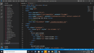
Download bootstrap 5.1 source code files. These files come with sass. Once it is done. open a text editor and create an index.html file.
Step 2
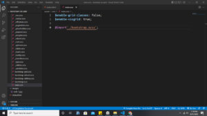
In your text editor, you need the scss so from there create a
main.scssand then import
@import'./bootstrap.scss';$enable-grid-classes: false;
$enable-cssgrid: true;What this code does is disables the default grid system by setting $enable-grid-classes: false and enabling the CSS Grid by setting $enable-cssgrid: true. Then, recompile your Sass.
You can use an extension in vs code like Sass/Less/Stylus/Pug/Jade/Typescript/Javascript Compile, to recompile your sass.
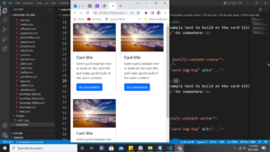
So far you should have something like this…
Once you recompile your sass the default bootstrap grid system the one with rows and columns will be changed to the CSS grid. Now you are working with bootstrap CSS Grid :).
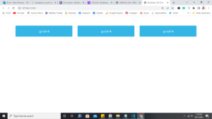
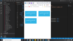
Three columns Layout
You can have three equal columns across all viewports and devices like this…
<div class="grid">
  <div class="g-col-4">.g-col-4</div>
  <div class="g-col-4">.g-col-4</div>
  <div class="g-col-4">.g-col-4</div>
</div>
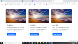
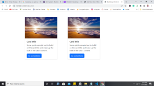
Same case if you had cards…

Responsive Layouts
You can use responsive classes to adjust your layout across viewports. Here we start with two columns on the narrowest viewports and then grow to three columns on medium viewports and above.
<div class="grid">
  <div class="g-col-6 g-col-md-4">.g-col-6 .g-col-md-4</div>
  <div class="g-col-6 g-col-md-4">.g-col-6 .g-col-md-4</div>
  <div class="g-col-6 g-col-md-4">.g-col-6 .g-col-md-4</div>
</div>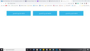
or…
You can try with other viewports and see what you will come up with.
Using Starts
Start classes have been used in bootstrap normal grid systems as offset classes. Using CSS grid you can use start classes like this if you are familiar with using them.
<div class="grid">
     <div class="g-col-3 g-start-2">.g-col-3 .g-start-2</div>
     <div class="g-col-4 g-start-6">.g-col-4 .g-start-6</div>
</div>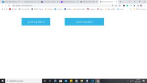
or using the cards you can have
Auto columns
When there are no classes on the grid items (the immediate children of a .grid), each grid item will automatically be sized to one column.
Ex:
<div class="grid">
  <div>1</div>
  <div>1</div>
  <div>1</div>
  <div>1</div>
</div>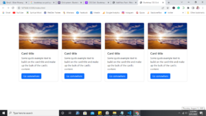
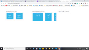
Nesting
CSS Grid allows for easy nesting of .grids. However, unlike the default, this grid inherits changes in the rows, columns, and gaps.
Ex:
<div class="container">
    <div class="grid pt-5" style="--bs-columns: 3;">
      <div>
        First auto-column
        <div class="grid">
          <div class="col">Auto-column</div>
          <div class="col">Auto-column</div>
        </div>
      </div>
      <div>
        Second auto-column
        <div class="grid" style="--bs-columns: 12;">
          <div class="col g-col-6">6 of 12</div>
          <div class="col g-col-4">4 of 12</div>
          <div class="col g-col-2">2 of 12</div>
        </div>
      </div>
      <div>Third auto-column</div>
    </div>