
Welcome to this tutorial on CSS FlexBox. In this post, we’ll cover the basics of Flexbox, so you can create flexible and responsive layouts for your web pages. We’ll start with an overview of what Flexbox is and why it’s important, then we’ll go over the basics and cover the most commonly used Flexbox properties. Finally, we’ll finish with a real-time example that you can use to practice and apply what you’ve learned.
Section 1: What is Flexbox?
Flexbox is a layout module in CSS that makes it easier to align and distribute content on a webpage. With Flexbox, you can create flexible and responsive layouts that adapt to different screen sizes and devices.
Section 2: The Basics of Flexbox
Let’s start with the basics. First, we’ll cover the Flexbox container, which is the parent element that contains the Flexbox items. Next, we’ll talk about Flexbox items, which are the child elements that are contained within the Flexbox container.
Example 1: Flexbox Container and Items
Let’s create a simple Flexbox layout using a container and items. In our HTML, we’ll start with a container element and add some items:
<div class="flex-container">
<div class="item">Item 1</div>
<div class="item">Item 2</div>
<div class="item">Item 3</div>
</div>
In our CSS, we’ll set the display property of the container to flex, like this:
.flex-container {
display: flex;
}
Output:
Item 1 Item 2 Item 3.item {
background-color: #f2f2f2;
padding: 10px;
}This will give our items a gray background color and some padding.
Example 2: Flexbox Properties
Now that we have a basic understanding of the Flexbox container and items, let’s talk about some commonly used Flexbox properties.
- Flex-direction: This property determines the direction of the main axis. The main axis is the primary axis along which Flexbox items are laid out. The default value is row, which lays out items horizontally.
- Justify-content: This property determines how Flexbox items are aligned along the main axis. Common values include center, flex-start, and flex-end.
- Align-items: This property determines how Flexbox items are aligned along the cross axis. The cross axis is perpendicular to the main axis. Common values include center, stretch, and baseline.
Let’s look at an example…
<div class="flex-container">
<div class="item">Item 1</div>
<div class="item">Item 2</div>
<div class="item">Item 3</div>
</div>And in our CSS we will update it with the following flexbox elements:
.flex-container {
display: flex;
flex-direction: row;
justify-content: space-between;
align-items: center;
}
.item {
background-color: #f2f2f2;
padding: 10px;
}display: flex property specifies that this is a Flexbox container. The flex-direction: row property specifies that the Flexbox items are arranged in a row. The justify-content: space-between property specifies that the items are evenly distributed with space between them. The align-items: center property centers the items vertically within the container.Example 3: Flexbox Wrapping
Another useful property in Flexbox is flex-wrap, which determines whether Flexbox items should wrap to the next row or column when they exceed the size of the container. Let’s add this property to our container and set it to wrap:
.flex-container {
display: flex;
justify-content: center;
align-items: center;
flex-wrap: wrap;
}
Now let’s add some more items to our container:
<div class="flex-container">
<div class="item item1">Item 1</div>
<div class="item item2">Item 2</div>
<div class="item item3">Item 3</div>
<div class="item item4">Item 4</div>
<div class="item item5">Item 5</div>
<div class="item item6">Item 6</div>
</div>
And let’s give our items a width of 200px and a height of 100px, and some margin and padding to space things out.
.flex-container {
display: flex;
justify-content: center;
align-items: center;
flex-wrap: wrap;
}

.item {
width: 200px;
height: 100px;
margin: 10px;
padding: 10px;
}

.item1 {
background-color: red;
flex: 1 1 auto;
}

.item2 {
background-color: green;
flex: 2 1 auto;
}

.item3 {
background-color: blue;
flex: 1 1 50%;
}

.item4 {
background-color: yellow;
flex: 1 1 50%;
}

.item5 {
background-color: purple;
flex: 1 1 33.33%;
}

.item6 {
background-color: orange;
flex: 1 1 66.66%;
}
Desktop Device: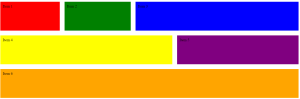
Mobile Device: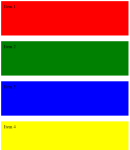
As you can see, we’ve added some new properties to the flex-container. justify-content: center centers the items horizontally, and align-items: center centers them vertically. We’ve also added flex-wrap: wrap to allow the items to wrap to the next line if there isn’t enough room.
We’ve also added some new properties to the individual items. flex: 1 1 auto means the item will grow and shrink as needed, flex: 2 1 auto means it will grow twice as much as the other items, and flex: 1 1 50% means it will take up 50% of the available space.
Item 5 takes up one-third of the width and item 6 takes up two-thirds of the width. You can adjust the flex values to change the size of each item.
Now let’s take a look at our final example, which uses flexbox to create a simple navigation bar.
nav {
display: flex;
justify-content: space-between;
align-items: center;
background-color: #333;
color: #fff;
padding: 20px;
}

nav img {
width: 100px;
height: auto;
order: 1;
}

nav ul {
display: flex;
list-style: none;
margin: 0;
padding: 0;
order: 2;
}

nav li {
margin-left: 10px;
}

nav a {
color: #fff;
text-decoration: none;
}
HTML:
<nav>
<img src="logo.png" alt="Logo">
<ul>
<li><a href="#">Home</a></li>
<li><a href="#">About</a></li>
<li><a href="#">Contact</a></li>
</ul>
</nav>

In this example, we’ve used display: flex to make the navigation bar a flexbox container. We’ve used justify-content: space-between to space the items out evenly, and align-items: center to center them vertically. We’ve also given the navigation bar a background color and some padding to make it stand out.
That’s it for our tutorial on Flexbox! We hope you’ve learned something new and feel confident using Flexbox in your own projects. Thanks for Reading!